Next to a still ad, video adds motion and sound, which catches attention and pulls an emotional response, and as social leans more on video, the weight of video ads keeps rising. Yet you can make one where the information is all there and it still leaves no impression. What matters in a video ad is that the eye lands on the element you want noticed. Give the element you want to stress some contrast, and the video stays memorable.
This guide covers go-to motion graphics moves that add impact to what you want to say. Use it when you are stuck on how to add impact, or cannot quite name a move you keep seeing.
What motion graphics is
Motion graphics is the technique of adding motion and effects to text, illustrations, and other graphics, which video ads use often. It conveys complex information simply and visually, landing a message in a short window. It shows up most in ads for intangible products, explaining how a service works or how an app is used, and for physical products, combining video and photos with motion graphics makes a more persuasive ad. The seven moves below are the ones easiest to use in a video ad.
Seven go-to moves that add impact
Bounce. A springy, hopping motion. It carries more visual impact than simply appearing, which helps stress a key message. For text, moving the whole word at once reads differently from staggering it letter by letter. Bounce also pairs well with shapes like speech bubbles, so it suits making microcopy stand out, and on an illustration it reads as energetic.
Scaling from off-screen. Growing or shrinking an element. For a scene where you want text large, animating letter by letter works, but showing the whole line large enough to burst past the frame, then shrinking it down, reads as dramatic. It suits a strong message: a limited-time sale, an appealing price, a USP. Over a still background, scaling the background up slowly keeps it from going flat, and adding a blur to the text, an effect that conveys motion and speed, makes it more natural.
Light effect. A streak of light running across. It suits text you want noticed, and pairs well with a badge-style design used to signal authority, sitting naturally on gold or silver. For cosmetics, a glint draws the eye to the packaging. The light effect runs short, so it fits even an ad with a tight runtime.
A line on the text. A handy move for stressing part of a sentence or a line of copy. A simple underline animation is versatile, and since the text itself does not move, you can stress a specific word in a longer sentence without losing legibility. In a narrated video with captions, applying it to a service name or a key strength inside the caption fixes that word in the viewer's mind. As a variation, a thick line plus an inverted text color pulls the eye hard.
Search box. You have seen ads that close on "search for this." A search box stays in memory and prompts a search after viewing, not just a conversion from the ad itself, and putting a service or product name in the box can lift awareness. Check that the search term is not too long and that the real results match the intent. Adding a typing motion and a final click or tap makes it richer, and matching the design to the device, a cursor for desktop, a tap for mobile, with the target in mind, sharpens it.
Animated data. Effective when you want to push numbers or data: a comparison against competitors, a survey or satisfaction result, cumulative sales. Beyond a simple move, a bar growing, a pie filling, a number counting up from zero shows the data visually and adds persuasion. It often needs an expression tuned to the product, so it runs a little harder to make, but it raises the video's quality several notches. Searching "infographics" turns up plenty of reference.
Animated illustrations. Animating illustrations and icons conveys a concept or a procedure clearly, which suits explaining how a product is used or how a service flows, and moving a static illustration breaks the monotony of the frame and lifts retention. Check each stock site's terms for the allowed range of edits before you alter an asset. Video assets keep the workload down, but to match the look of your illustrations and icons, animating stills is worth considering, and a partial move, a clock's hands, or a slight left-right shift of a character's face, already changes the impression from a still.
Add sound effects for another level
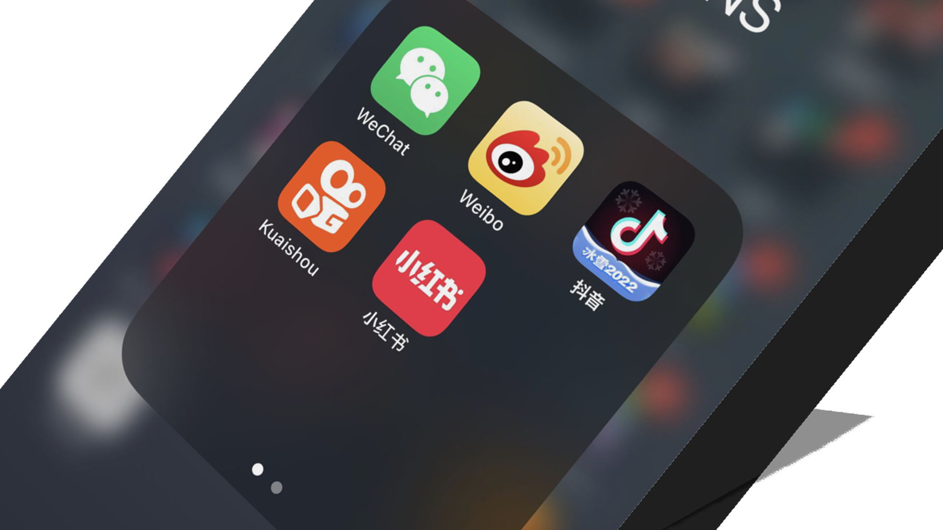
Apart from BGM, adding a sound effect lifts the video a level. On YouTube and TikTok especially, a high share of viewers watch with sound on, so SEs matter. Adding one in time with a motion or an effect stresses that scene, so use SEs at the "right here" moments, the campaign hook for purchase or the CTA.
Build your own reference library
These are a small slice of what motion graphics can do. Screen-record the ads served to you and stock them as reference, and look for what memorable video ads have in common and put it into words. Replaying video ads to study the fine moves, or following professional video makers on social, builds the eye over time. Sharing a reference like this at the storyboard stage also helps keep the person ordering the video and the person making it on the same page.